ExpandingMenu
Description
Displays a list of menu items. Menus can have sub-menus. Sub-menus are animated into view when expanded.
Discussion
The Expanding Menu control displays a list of menu choices, some of which may have sub-choices (indicated by an icon at the right edge of the item). When a menu item is clicked, it can invoke Javascript code. If the menu has a sub-menu, the sub-menu is shown using animation.
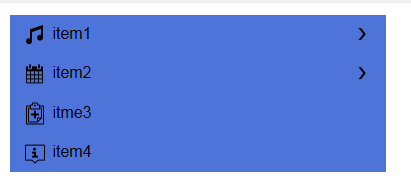
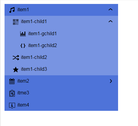
In the image below the Expanding Menu is shown in its full collapsed state and it a partially expanded state.
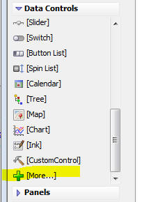
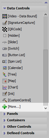
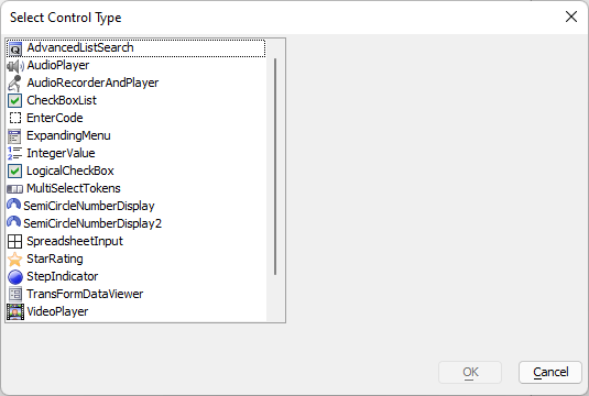
To add an Expanding Menu control to your UX component, select the [More...] item in the Data Controls category.
The Expanding Menu control is in the Data Controls section, because, like all Data Controls, it has a {dialog.object}.setValue() and a {dialog.object}.getValue() method. The 'value' of the current selection in the Expanding menu is defined by the 'value' property for each node in the tree (see below).
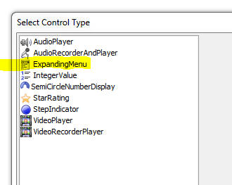
Then select the ExpandingMenu option from the dialog.
To configure the Expanding Menu control, click the smart field for the Control properties property.
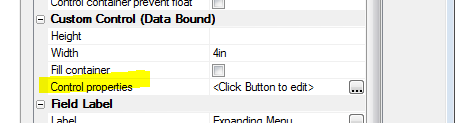
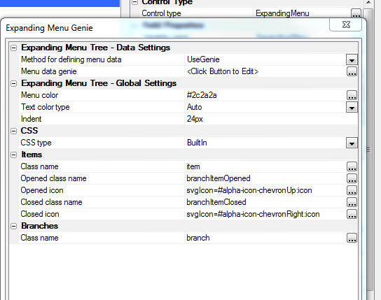
This will bring up a genie where you can define the choices shown in the Expanding Menu and also set other properties.
To define the choices and sub-choices shown in the menu click on the smart field for the Menu data genie property.
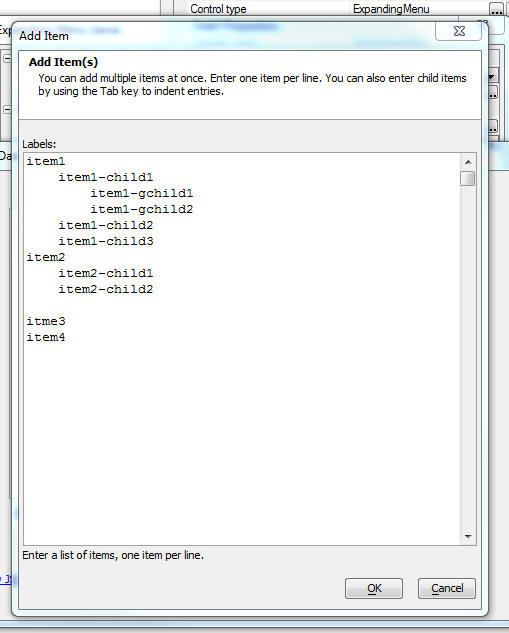
This will bring up a dialog where you can type in your menu choices, using tab indents to indicate which menu choices are sub-choices.
For example, in the image below, the top level menu choices are:
item1
item2
item3
item4
Item1 and item2 hav3 sub-choices.
When you close the Add Item dialog, the Tree Data Genie is shown (see image below). This dialog allows you to set properties for each menu item in menu tree.
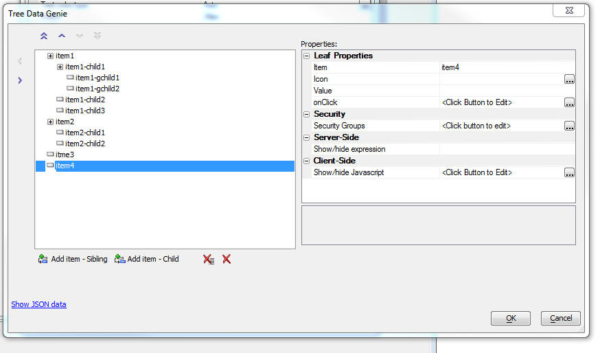
Properties that you can set include:
- Item
The HTML text show in the menu.
- Icon
An optional icon shown to the left of the menu text.
- Value
An optional value that indicates what the value of the Expanding Menu control will be if this menu item is selected.
If you want to use Data Control methods, such as {dialog.object}.setValue() and {dialog.object}.getValue(), or the Expanding Menu's collapseMenu() method, you must define a Value for the menu items in the control.
- Security groups
If using the Security Framework- the security groups that can see this menu item. If a menu item is hidden because it is not in the specified security group, the menu item and all of its children are hidden.
- Server-side show/hide expression
An expression that is evaluated server-side to determine if the menu item should be shown. Server-side show/hide expressions typically involve session variables. Enter an expression that evaluates to .t. or .f.
- Client-side show/hide Javascript
Javascript code that returns a true or false value. If the code returns false, the menu item (and all of its children) are now shown.
Expanding Menu Topics
- Name
- Description
- Collapsing the Expanding Menu Selecting an Action
You can close a branch in the Expanding Menu when an action is triggered using the Expanding Menu's collapseMenu() method.
- Dynamically Populating an ExpandingMenu Using Ajax Callbacks
The Expanding Menu control can be populated using server-side Xbasic. This allows you to create a dynamic menu at run-time based on data in a SQL database or computed from an Ajax Callback.
Expanding Menu Control Methods
The Expanding Menu control is a ViewBox control. You can use all of the standard ViewBox Methods with the Expanding Menu's JavaScript object. You can get a pointer to the Expanding Menu control's JavaScript object using the {dialog.object}.getControl() method:
var menuObj = {dialog.object}.getControl('EXPANDINGMENU_1');In addition to the standard ViewBox methods, the following Expanding Menu object methods are available for working with the Expanding Menu control:
collapseMenu()
Collapses a branch in the Expanding Menu. In order to use this function, you must define a value for the menu branches you want to collapse.
var menuObj = {dialog.object}.getControl('EXPANDINGMENU_1');
if (menuObj) {
    var menuNode = 'Clients';
    menuObj.collapseMenu(menuNode);
}
See Collapsing the Expanding Menu Selecting an Action to learn more.
Additional Functions and Methods
Client-side
In addition to the standard methods for working with Data Controls, you can use JavaScript the methods below to manipulate the Expanding Menu control:
- {dialog.object}.refreshExpandingMenuData()
Refresh the menu options in the Expanding Menu control by making an Ajax Callback to the server to retrieve the menu.
- {dialog.object}.populateExpandingMenuControl()
Repopulates the Expanding Menu control with a new set of menu options passed to the method as a JSON object.
Server-side
Xbasic functions for working with Expanding Menus.
- a5_sqlToJSONExpandingMenu()
Generates JSON to populate an Expanding Menu control from a SQL query.
- a5wcb_convertFriendlyMenuToExpandingMenuJSONData()
Generates the JSON to populate an Expanding Menu control from a 'friendly' menu definition.
Inserting an Add-in Control
Add-in Controls are inserted using the More... option in the Data Controls section of the UX Builder.
Select the control you would like to add and click OK.
In addition to the controls that ship with Alpha Anywhere, you can also create your own add-in controls. See How to Create Add-in Controls to learn more.
Videos
Collapsing Menu When Selecting an Action
When you select the action on a leaf node in an Expanding Menu control, you might want to collapse the menu so that some or all of the expanded nodes are collapsed.
In this video, we show how an expanded node in an Expanding Menu control can be collapsed.
Dynamically Populating an Expanding Menu with Ajax Callbacks
This video shows how you can dynamically populate an Expanding Menu control with data computed in an Ajax callback.
See Also